Introducing Layout
In this section of the tutorial, you'll become familiar with building layouts using Flexbox in Litho for an Instagram post component.
Yoga and Flexbox
To measure and layout on-screen components, Litho uses the Yoga library, which is an implementation of Flexbox.
To learn more about Flexbox, see the Layout System with Flexbox page in the 'Main Concepts' section.
Preparatory data model classes
Before you start with the main content of this section of the tutorial, add two simple classes that represent the 'User' and 'Post' data models.
class User(val username: String, @DrawableRes val avatarRes: Int)

class Post(
    val id: String,
    val user: User,
    @DrawableRes val imageRes: Int,
    val text: String? = null
)
The PostComponent
With the data models prepared, it's time to build a component for a post that features two images and one item of text laid out in a tabular format.
For now, as far as layout is concerned, it's enough to know that the component uses Column and Row (known as 'containers'). These containers are used to arrange the images and text (known as 'primitives') vertically and horizontally, respectively.
With the containers and primitives in mind, a Post component that renders the UI of an Instagram post look as follows:
class PostComponent(val post: Post) : KComponent() {
  override fun ComponentScope.render(): Component {
    return Column {
      child(
          Row {
            child(Image(drawable = drawableRes(post.user.avatarRes)))
            child(Text(text = post.user.username, textStyle = Typeface.BOLD))
          })
      child(
          Image(
              drawable = drawableRes(post.imageRes),
              scaleType = ImageView.ScaleType.CENTER_CROP,
              style = Style.aspectRatio(1f)))
    }
  }
}
Though the components are placed in a defined tabular format, the layout doesnt look good. So, as a final touch, you can make it look more stylish with a Flexbox style.
Applying a Flexbox style
The following code shows the effect of using a Flexbox style on the Post component (notice the additional props for width, height, padding, and margin):
class PostStyledKComponent(val post: Post) : KComponent() {
  override fun ComponentScope.render(): Component {
    return Column {
      child(
          Row(alignItems = YogaAlign.CENTER, style = Style.padding(all = 8.dp)) {
            child(
                Image(
                    drawable = drawableRes(post.user.avatarRes),
                    style = Style.width(36.dp).height(36.dp).margin(start = 4.dp, end = 8.dp)))
            child(Text(text = post.user.username, textStyle = Typeface.BOLD))
          })
      child(
          Image(
              drawable = drawableRes(post.imageRes),
              scaleType = ImageView.ScaleType.CENTER_CROP,
              style = Style.aspectRatio(1f)))
    }
  }
}
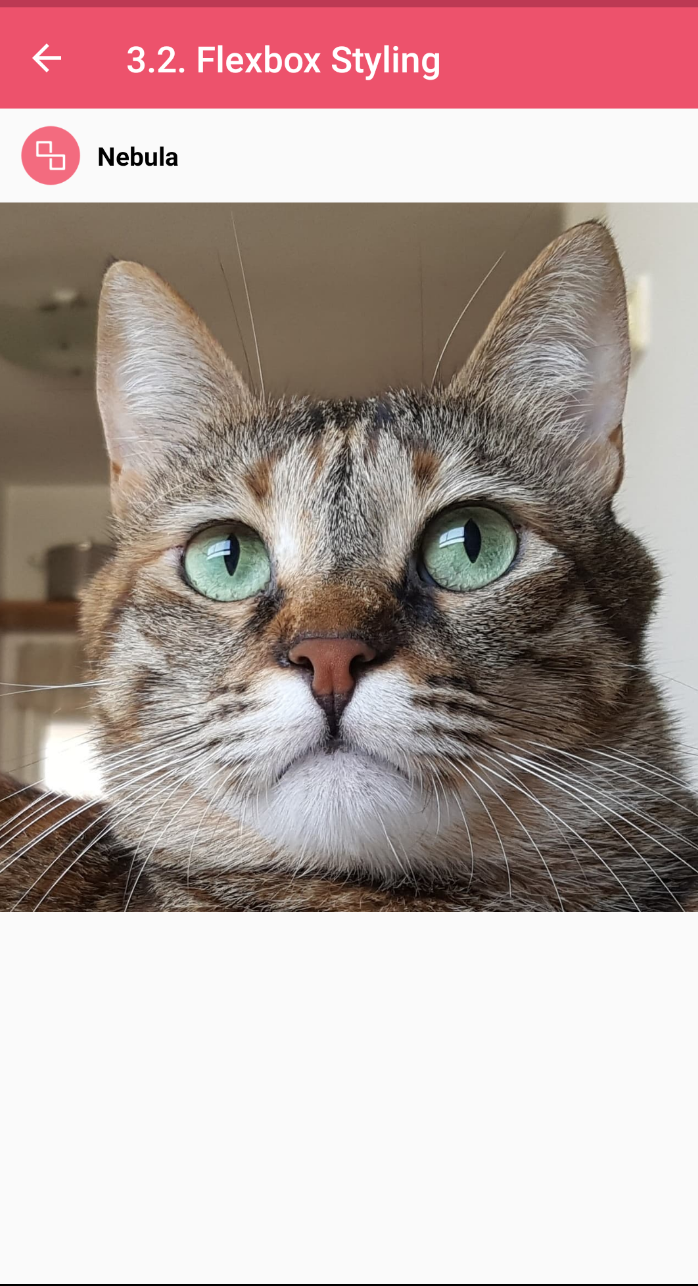
With the Flexbox style applied, your component should look like the following image.
Key Points in PostStyledKComponent.kt
ColumnandRow- the key container types in Litho.paddingandmargin- props that set padding and margin usingDimen(a class that represents dimension values in different Android units: 'px', 'dp', and 'sp').drawableRes- returns an Android Drawable from resource ID.Image- image is another built-in component that can render a drawable.
What next?
In the next section of the tutorial, Adding State, you'll learn about 'useState', one of Litho's 'hooks'.
For more information, see Layout System with Flexbox in the 'Main Concepts' section.