Flexbox Containers
This page covers how to convert existing code from the Spec API to the Kotlin API.
For the main Flexbox documentation, refer to the Layout System with Flexbox page.
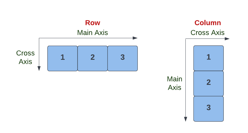
Rows and Columns, revisited
As with the Spec API, Row and Column are the primary layout containers used in the Kotlin API.
Differences between the Kotlin API and the Spec API
When using Row and Column, there are a few important differences between the Spec API and the Kotlin API:
- Props of Rows and Columns - props that configure the
Row/Columnitself, likealignItemsorjustifyContent, now appear as props directly on the container component. In this way, there is no difference from setting props on any other component. - Common Props - props that configure a particular child's positioning within the context of a
Row/Column, likealignSelforflex, now appear with other common props on theStylepassed to that child. This is akin toLayoutParamsin vanilla Android in that they must be able to go on any component and are read by the parent. - Children - children are added within a trailing lambda using the
child()calls.
The following snippet illustrates the points above:
 Column(alignItems = YogaAlign.CENTER, style = Style.padding(all = 8.dp)) {
   child(Text(text = "Foo", style = Style.flex(grow = 1f)))
   child(Text(text = "Bar"))
 }
Migrating from the Spec API
Without code-generated builders, Litho had to make a distinction between props of the container itself and common props that can be set on children of the container.
For example, alignItems configures the default alignment for children in this container and is only valid on a flexbox container. It's set like a normal component prop on Row/Column.
On the other hand, alignSelf can be respected on any child of a container, whether it's a Text, a Switch, or some custom Component: it's therefore exposed as a common prop via Style.
The benefit of this is that developers can now statically verify all required props are set instead of verifying at runtime (as well as not rely on codegen!).
Flexbox properties cheatsheet
The following table helps to identify whether to set a layout property directly on the Row/Column or on the Style:
| Flexbox Property | Configures a Specific Child? | Example Kotlin API Usage |
|---|---|---|
justifyContent | No | Row(justifyContent = YogaJustify.CENTER) |
alignContent | No | Row(alignContent = YogaAlign.CENTER) |
alignItems | No | Row(alignItems = YogaAlign.CENTER) |
wrap | No | Row(wrap = YogaWrap.NO_WRAP) |
alignSelf | Yes | Style.alignSelf(YogaAlign.CENTER) |
flexBasis | Yes | Style.flex(basis = 8.dp) |
flexBasisPercent | Yes | Style.flex(basisPercent = 25f) |
flexGrow | Yes | Style.flex(grow = 1f) |
flexShrink | Yes | Style.flex(shrink = 1f) |
margin | Yes | Style.margin(8.dp) |
padding | Yes | Style.padding(8.dp) |
width | Yes | Style.width(50.dp) |
height | Yes | Style.height(50.dp) |
A property is set via Style if and only if it configures a specific child!
Example migration
Below is an example of a simple Component using various layout properties, converted to an equivalent KComponent:
- Kotlin API
- Spec API
class FlexboxComponent(
    private val username: String,
    @DrawableRes private val avatarRes: Int,
    @DrawableRes private val imageRes: Int
) : KComponent() {
  override fun ComponentScope.render(): Component {
    return Column {
      child(
          Row(alignItems = YogaAlign.CENTER, style = Style.padding(all = 8.dp)) {
            child(
                Image(
                    drawable = drawableRes(avatarRes),
                    style = Style.width(36.dp).height(36.dp).margin(start = 4.dp, end = 8.dp)))
            child(Text(text = username, textStyle = Typeface.BOLD))
          })
      child(
          Image(
              drawable = drawableRes(imageRes),
              scaleType = ImageView.ScaleType.CENTER_CROP,
              style = Style.aspectRatio(1f)))
    }
  }
}
@LayoutSpec
public class JavaApiComponentSpec {

  @OnCreateLayout
  static Component onCreateLayout(
      ComponentContext c, @Prop String username, @Prop int avatarRes, @Prop int imageRes) {
    return Column.create(c)
        .child(
            Row.create(c)
                .paddingDip(YogaEdge.ALL, 8)
                .alignItems(YogaAlign.CENTER)
                .child(
                    Image.create(c)
                        .drawableRes(avatarRes)
                        .widthDip(36)
                        .heightDip(36)
                        .marginDip(YogaEdge.START, 4)
                        .marginDip(YogaEdge.END, 8))
                .child(Text.create(c).text(username).textStyle(Typeface.BOLD)))
        .child(
            Image.create(c)
                .drawableRes(imageRes)
                .scaleType(ImageView.ScaleType.CENTER_CROP)
                .aspectRatio(1))
        .build();
  }
}