Layout Specs
This page covers the old Java Spec API. If you're not using the Spec API, refer to the Components page.
- Java
- Kotlin
A layout spec is the logical equivalent of a composite view on Android; it simply groups existing components together in an immutable layout tree.
Implementing a layout spec is very simple: just write one method annotated with @OnCreateLayout, which returns an immutable tree of Component objects.
Following is a simple example:
@LayoutSpec
public class MyComponentSpec {

  @OnCreateLayout
  static Component onCreateLayout(
      ComponentContext c,
      @Prop int color,
      @Prop String title) {
      return Row.create(c)
          .alignItems(CENTER)
          .child(
              SolidColor.create(c)
                  .colorRes(color)
                  .widthDip(40)
                  .heightDip(40))
          .child(
              Text.create(c)
                  .text(title)
                  .textSizeRes(R.dimen.my_text_size)
                  .flexGrow(1f))
          .build();
  }
}
As can be seen from the example above, layout spec classes use the @LayoutSpec annotation.
The method annotated with @OnCreateLayout must have ComponentContext as its first argument followed by a list of arguments annotated with @Prop. The annotation processor will validate this and other invariants in the API at build time.
In the example above, the layout tree has a root Container with two children stacked horizontally (Row.create) and vertically centered (Align.CENTER).
The first child is a SolidColor component that takes a colorRes prop and has a 40dp width and height:
SolidColor.create(c)
    .colorRes(color)
    .width(40)
    .height(40)
The second child is a Text component that takes a prop named text and fills the remaining horizontal space available in MyComponent by using grow(1f) (equivalent to Android's layoutWeight from LinearLayout). The text size is defined in my_text_size dimension resource:
Text.create(c)
    .text(title)
    .textSizeRes(R.dimen.my_text_size)
    .grow(1f)
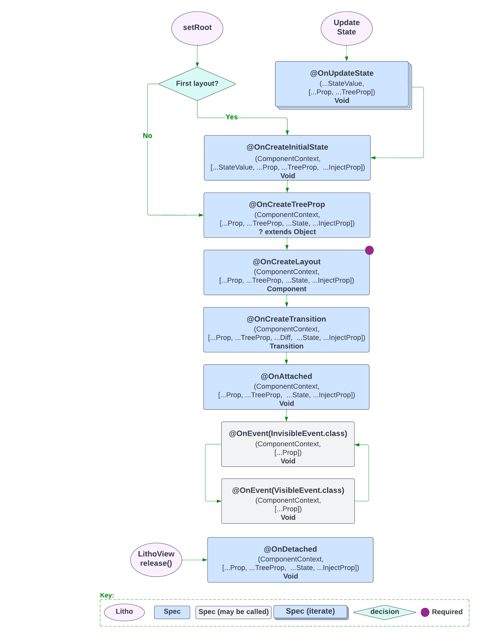
The following image shows the Layout Specification Lifecycle.

To see all the layout features that the framework exposes, refer to the Yoga documentation.
A layout spec is the logical equivalent of a composite view on Android. It simply groups existing components together in an immutable layout tree.
Let's start with a simple example:
@LayoutSpec
object MyComponentSpec {

  @OnCreateLayout
  fun onCreateLayout(
      c: ComponentContext,
      @Prop image: String,
      @Prop(optional = true) imageAspectRatio: Float): Component =
      Row.create(c)
          .alignItems(CENTER)
          .child(
              SolidColor.create(c)
                  .colorRes(color)
                  .widthDip(40)
                  .heightDip(40))
          .child(
              Text.create(c)
                  .text(title)
                  .textSizeRes(R.dimen.my_text_size)
                  .flexGrow(1f))
          .build()
}
As you can see, layout spec classes use the @LayoutSpec annotation.
The method annotated with @OnCreateLayout must have ComponentContext as its first argument followed by a list of arguments annotated with @Prop. The annotation processor will validate this and other invariants in the API at build time.
In the example above, the layout tree has a root Container with two children stacked horizontally (Row.create) and vertically centered (Align.CENTER).
The first child is a SolidColor component that takes a colorRes prop and has a 40dp width and height.
SolidColor.create(c)
    .colorRes(color)
    .width(40)
    .height(40)
The second child is a Text component that takes a prop named text and fills the remaining horizontal space available in MyComponent by using grow(1f) (equivalent to Android's layoutWeight from LinearLayout). The text size is defined in my_text_size dimension resource.
Text.create(c)
    .text(title)
    .textSizeRes(R.dimen.my_text_size)
    .grow(1f)
The following image shows the Layout Specification Lifecycle.

To see all the layout features that the framework exposes, refer to the Yoga documentation.