Tutorial
This tutorial assumes you've gone through the Getting Started guide to set up Litho. Make sure you set up Litho's core libraries and Sections' libraries.
In this tutorial, you'll start by building a basic "Hello World!" screen using Litho and work your way up to creating a list of "Hello World!" items on the screen. Along the way, you'll learn about the building blocks of Litho: Component, and LithoView. You will also learn how to create lists with Section and how to set properties on components.
1. Hello World
In this initial step, you'll display a view with "Hello World!".
First, initialize SoLoader in your Application class:
class SampleApplication : Application() {
  override fun onCreate() {
    super.onCreate()

    SoLoader.init(this, false)
  }
}
Behind the scenes, Litho uses Yoga for layout. Yoga has native dependencies and SoLoader is brought in to take care of loading those. Initializing SoLoader here ensures that you're not referencing unloaded libraries later on.
Next, add a predefined Text Litho component to an activity:
@Override
public void onCreate(Bundle savedInstanceState) {
    super.onCreate(savedInstanceState);

    final ComponentContext c = new ComponentContext(this);

    final Component component = Text.create(c)
        .text("Hello World")
        .textSizeDip(50)
        .build();

    setContentView(LithoView.create(c, component));
}
LithoView is an Android ViewGroup that can render components; it is the bridge between Litho components and Android Views. The example sets the content for the activity to a LithoView that displays a Text component.
How do the components come into play? Let's zero in on this piece of code:
Text.create(c)
    .text("Hello World")
    .textSizeDip(50)
    .build();
Text is a core component defined in com.facebook.litho.widget. It has a number of properties such as text and textSize which you can set as shown. These properties are called props as inspired by React terminology.
You'll learn how to write your own components later but it's worth noting the Text class is generated from a TextSpec class. The generated component class provides a builder API with methods to define values for the component's props.
The Text component is added as a single child component to the LithoView in the example. You could instead have a single root component with several child components. You'll see how to do this in later steps.
That's it! Run the app, you should see something like this:
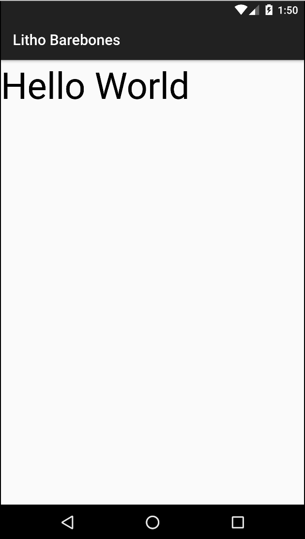
Not pretty, but this is certainly a start!
2. Your First Custom Component
At the end of this tutorial you'll have a simple, scrollable list. This list will just display an item with a title and subtitle a whole lot of times. Exciting times! In this part of the tutorial, you'll write a simple component that is the list item. Naturally, a real world app would define a more complicated component but you'll learn all the basics you need to do that in this example.
Ready? It's time to dive in and build this component. In Litho, you write Spec classes to declare the layout for your components. The framework then generates the underlying component class that you use in your code to create a component instance.
Your custom component will be called ListItem and it will display a title with a smaller subtitle underneath. Therefore, you need to create a class named ListItemSpec with the following content:
@LayoutSpec
public class ListItemSpec {

  @OnCreateLayout
  static Component onCreateLayout(ComponentContext c) {

    return Column.create(c)
        .paddingDip(ALL, 16)
        .backgroundColor(Color.WHITE)
        .child(
            Text.create(c)
                .text("Hello world")
                .textSizeSp(40))
        .child(
            Text.create(c)
                .text("Litho tutorial")
                .textSizeSp(20))
        .build();
  }
}
You should recognize the Text component from the previous tutorial step. In this example, you're passing it in as a child property of a Column. You can think of a Column as equivalent to a <div> in HTML. It's a wrapper, used mainly for collating things together and perhaps adding some background styling. Since Litho uses Yoga, you can add flexbox attributes to set the layout for the children of a Column or a Row. Here, you simply set the padding and the background color.
How do you render this component? In your activity, simply change the Component definition to:
final Component component = ListItem.create(c).build();
That's ListItem you're using, not ListItemSpec.
Where did ListItem come from? Where are create and build defined? This is the magic of Litho Specs.
In the Getting Started guide, we saw how to add the dependencies to your project to make Litho code generation work.
This runs an annotation processor over your code. It looks for FooSpec class names and generates Foo classes with the same package as your spec. These classes will have all the methods required by Litho automatically filled in. In addition, based upon the specification, there will be extra methods (such as Text's .textSizeSp or the .backgroundColor method of Column/Row) generated by annotation processor.
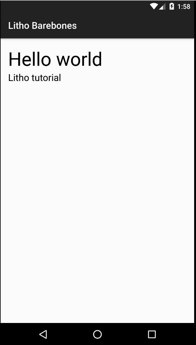
It's as simple as that. Run your app. You should see something like this:
3. Creating a List of Items
You can create lists in Litho by using the RecyclerCollectionComponent and the Sections library. RecyclerCollectionComponent is used for creating scrollable units in Litho and it hides some of the complexity of having to work directly with Android's RecyclerView and Adapter concepts.
With the Sections API, you group the items in your list into sections and write GroupSectionSpec classes to declare what each section renders and what data it uses.
Ready? It's time to build this section. Your custom section will be called ListSection and it will render ListItem components. Create a class named ListSectionSpec with the following content:
@GroupSectionSpec
public class ListSectionSpec {

  @OnCreateChildren
  static Children onCreateChildren(final SectionContext c) {
    Children.Builder builder = Children.create();

    for (int i = 0; i < 32; i++) {
      builder.child(
          SingleComponentSection.create(c)
              .component(ListItem.create(c).build()));
    }
    return builder.build();
  }
}
SingleComponentSection is a core section defined in com.facebook.litho.sections.widget that renders a single component. ListSectionSpec describes a section that has 32 child sections, each of which is responsible for rendering a ListItem. We can use this section with RecyclerCollectionComponent to render our list. RecyclerCollectionComponent takes a section as a prop and renders a RecyclerView containing whatever UI the section outputs. It also manages updates and changes from the section such as refreshing data and performing tail fetches. We're not using any data fetching here so lets disable PTR (pull to refresh) for this tutorial. In your activity, change the component definition to:
final Component component =
    RecyclerCollectionComponent.create(c)
        .disablePTR(true)
        .section(ListSection.create(new SectionContext(c)).build())
        .build();
That's ListSection you're using, not ListSectionSpec.
ListSectionSpec should look familiar to the ListItemSpec you wrote in the last step! Litho runs annotation processors over your code to find ListSectionSpec and generates ListSection just like how it finds ListItemSpec and generates ListItem in the same package as your spec.
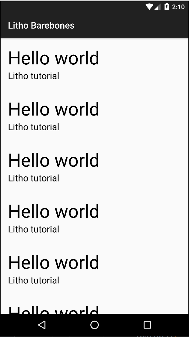
Run the app. You should see a scrollable list of 32 ListItem components:
4. Defining a Component's properties
Lists are no good if they only contain repetitive copies of a single component. In this part, you'll look at properties or props. These are attributes you can set on components to change their behavior or appearance.
Adding props to a component is very simple. Props are parameters to methods of the component specification, annotated with the @Prop annotation.
Modify ListItemSpec as follows:
@OnCreateLayout
static Component onCreateLayout(
    ComponentContext c,
    @Prop int color,
    @Prop String title,
    @Prop String subtitle) {

  return Column.create(c)
        .paddingDip(ALL, 16)
        .backgroundColor(color)
        .child(
            Text.create(c)
                .text(title)
                .textSizeSp(40))
        .child(
            Text.create(c)
                .text(subtitle)
                .textSizeSp(20))
        .build();
}
This adds three props: title, subtitle and color props. Notice that the background color and the strings for the Text components' text are no longer hard-coded and are now based on the onCreateLayout method parameters.
The magic happens in the @Prop annotations and the annotation processor. The processor generates methods on the component builder that correspond to the props in a smart way. You can now change ListSectionSpec to specify properties when constructing ListItem:
@OnCreateChildren
static Children onCreateChildren(final SectionContext c) {
  Children.Builder builder = Children.create();

  for (int i = 0; i < 32; i++) {
    builder.child(
        SingleComponentSection.create(c)
            .component(ListItem.create(c)
               .color(i % 2 == 0 ? Color.WHITE : Color.LTGRAY)
               .title(i + ". Hello, world!")
               .subtitle("Litho tutorial")
               .build()));
  }
  return builder.build();
}
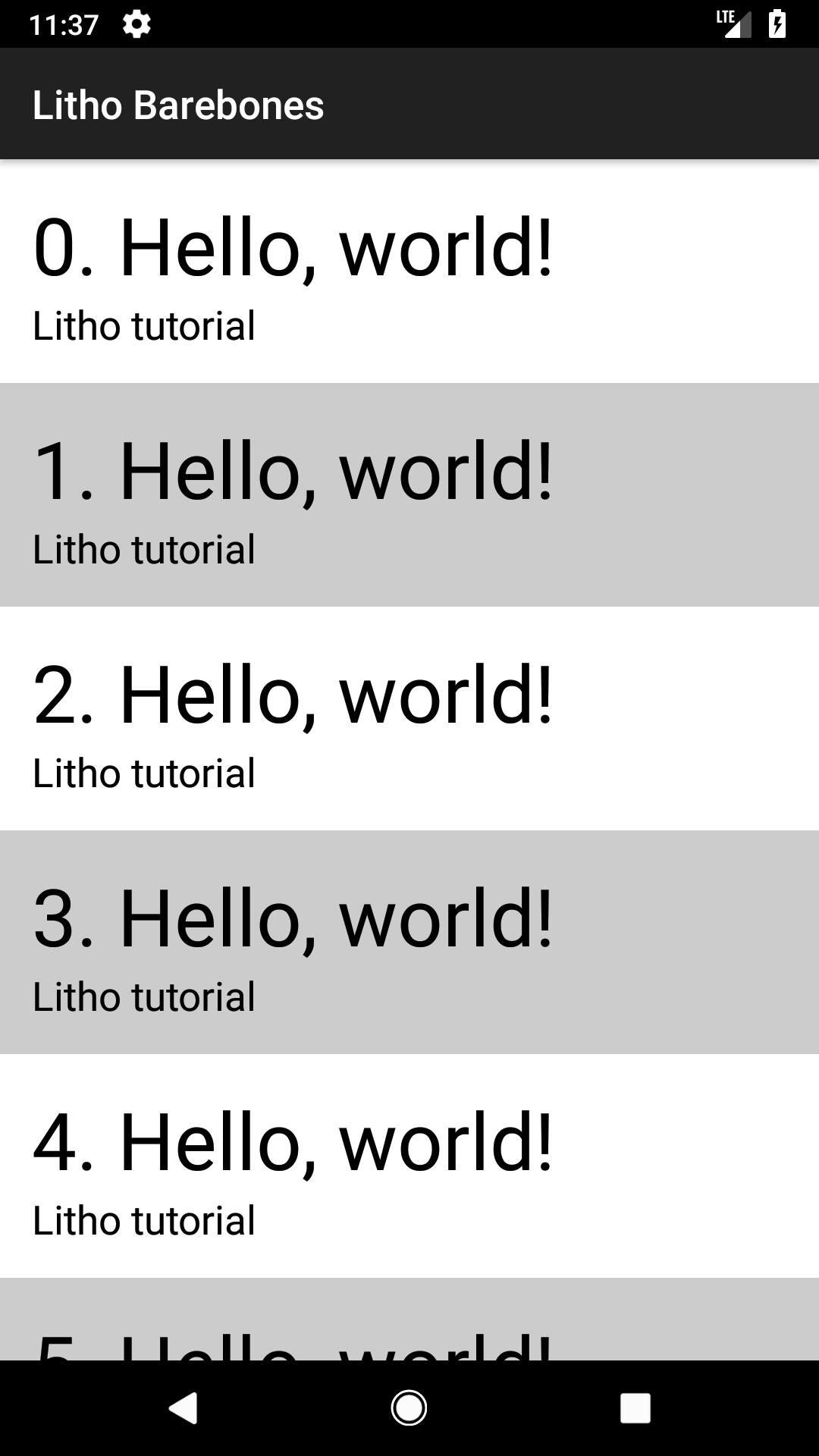
Now when ListItem is constructed, the color, title and subtitle props are passed in with the background color alternating for each row.
Run the app. You should see something like this:
You can specify more options to the @Prop annotation. For example, consider the property:
@Prop(optional = true, resType = ResType.DIMEN_OFFSET) int shadowRadius,
This tells the annotation processor to construct a number of functions, such as shadowRadiusPx, shadowRadiusDip, shadowRadiusSp as well as shadowRadiusRes.
Summary
Congratulations on completing this tutorial! This basic tutorial should arm you with all the building blocks to start using Litho and building your own components. You can find the predefined widget components you can use in the com.facebook.litho.widgets and com.facebook.litho.sections.widget packages. You can find the completed tutorial here. Be sure to check out this sample for more in-depth code as well as the Litho API documentation.
Looking for more?
We briefly talked about Sections in this tutorial when building the list. The Sections framework makes it easy to build complex lists in a declarative, composable way. Learn more in an optional part 2 of this tutorial here.